
How the Philadelphia Art Museum is reinventing itself for the Instagram age
- The Philadelphia Art Museum has rebranded itself as simply “Philadelphia Art Museum” (PhAM) to appeal to a younger and more diverse audience, signaling a transformation in tone, purpose, and reach.
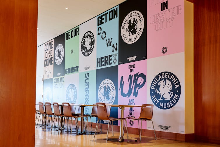
- The new logo features a bold, circular emblem that is designed to hold its own on a phone screen, with the iconic griffin symbol revived but placed in a more dynamic position.
- The rebrand aims to make the museum more flexible and less formal, embracing an era where visitors first encounter culture through screens rather than doors, and ensuring that it lives “not only on the parkway but in the algorithm.”
- However, there are risks associated with the new branding, including the potential for some longtime patrons to bristle at the casual tone, and the risk of dissolving into the noise of digital sameness if the brand becomes too flexible.
- The rebrand is seen as a nod to the way folks from Philly actually talk about the place, and a gesture towards courting a new cohort of museumgoers who might never have thought of the museum as “for them” in the first place.
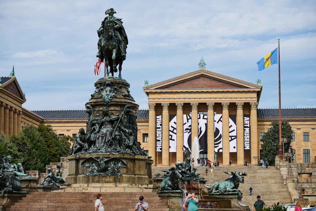
On Philadelphia’s famed Benjamin Franklin Parkway, where stone, symmetry and civic ambition meet, something subtle yet seismic has happened.
The city’s grandest temple to art has shed a preposition.
After nearly a century as the Philadelphia Museum of Art, or PMA, the institution now calls itself simply the Philadelphia Art Museum – or PhAM, as the new logo and public rollout invite us to say.
The change may seem cosmetic, but as a marketing scholar at Temple University whose research focuses on branding and digital marketing strategy, I know that in the tight geometry of naming and branding, every word matters.
The museum’s new identity signals not just a typographic update but a transformation in tone, purpose and reach. It’s as if the museum has taken a long, deep breath … and decided to loosen its collar.
Insta-friendly design
For decades, the museum’s granite facade has represented permanence. Its pediments crowned with griffins – mythological creatures that are part lion and part eagle – have looked out across the parkway like silent sentinels of culture. The rebrand dares to make those sentinels dance.
In its new form, PhAM is deliberately more flexible, less marble, more motion. The logo revives the griffin but places it with a bold, circular emblem that is unmistakably digital. The new logo is chunkier, more assertive and designed to hold its own on a phone screen.
Like the 2015 Metropolitan Museum of Art’s digital overhaul in New York, the Philadelphia Art Museum is leaning into an era where visitors first encounter culture through screens, not doors. As the Met’s former chief digital officer Sree Sreenivasan stated, “Our competition is Netflix and Candy Crush,” not other museums.
The PhAM’s visual language is redesigned for environments filled with scrolling, swiping and sharing. Through this marketer’s lens, the goal is clear: to ensure that the museum lives not only on the parkway but in the algorithm.
Rob Cusick/Philadelphia Art Museum
A little younger, more cheeky
There is something refreshing about a legacy institution willing to meet its existing or future audience where they already are. The museum’s leadership frames the change as a broader renewal – a commitment to accessibility, community and openness.
The rebrand showcases “Philadelphia” and it takes center stage in the new name and logo, a subtle but potent reminder that the museum’s roots are here. In the previous design, the word “Art” was much larger and more bolded than “Philadelphia.”
And then there’s the nickname: PhAM. It’s playful – think, “Hey, fam!” or a Batman comic-style Pow! Bam! PhAM! – compact, easy to say and just cheeky enough to intrigue a new generation. It’s Instagrammable and hashtaggable. It’s got trending power. I asked a lecture hall full of marketing students in their 20s what they thought of it, and they generally loved it. They thought it was “fun,” “hip” and had enough “play” in the name to make them want to visit.
It’s also a nod to the way folks from Philly actually talk about the place. No one in Philadelphia ever says, “Let’s go to the Museum of Art.” They call it “the Art Museum.” The brand finally caught up with the vernacular.
A balancing act
Rebrands in the cultural sector are rarely simple makeovers. They are identity reckonings.
The Tate Modern in London mastered this dance in 2016 when it modernized its graphics and digital outreach while keeping the weight of its bones intact.
Others have stumbled.
When the Whitney Museum in New York debuted a minimalist “W” in 2013, reactions were mixed. To me, it felt more like a tech startup than a place of art.
PhAM now faces that same paradox. How does the cultural institution appear modern without erasing its majesty? Museums, after all, trade in authority as much as accessibility.
The new name carries subtle risks. Some longtime patrons may bristle at the casual tone. And the phrase “Museum of Art” carries an academic formality that “Art Museum” softens.
And the more flexible a brand’s logo or voice becomes, the more it risks dissolving into the noise of digital sameness. While brands must adapt their visuals and tone to fit different social media platforms and audiences, there is a fine line between flexibility and dilution. The more a brand’s logo, voice or visual identity bends to accommodate every digital trend or platform aesthetic, the greater the risk that it loses its edge.
For example, when too many brands adopt a minimalistic sans-serif logo – as we’ve seen with fashion brands such as Burberry and Saint Laurent – the result is a uniform aesthetic that makes it difficult for any single identity to stand out.
Flexibility should serve differentiation, not erode it.
In the end, I appreciate how PhAM’s revival of the griffin, steeped in the building’s history, keeps the brand tethered to its architectural DNA.
For now, the rebrand communicates both humility and confidence. It acknowledges that even icons must learn to speak new languages. The gesture isn’t just aesthetic; it’s generational. By softening its posture and modernizing its voice, the Philadelphia Art Museum appears intent on courting a new cohort of museumgoers used to stories unfolding on screens. This is a rebrand not merely for the faithful but for those who might never have thought of the museum as “for them” in the first place.

Sheri Lambert, CC BY-NC-SA
Read more of our stories about Philadelphia and Pennsylvania, or sign up for our Philadelphia newsletter on Substack.
![]()
Sheri L. Lambert does not work for, consult, own shares in or receive funding from any company or organization that would benefit from this article, and has disclosed no relevant affiliations beyond their academic appointment.